Building an app, website, social product or online game? You’ll be surprised at how many things you can learn from the slot machine game design and how it creates an unbreakable habit necessary for successful products.
We’ve all heard of gamification (elements of game-design applied to non-game products) but have you heard of slotification?
The slot machine game design goes beyond just the flashy lights and cha-ching-ing of the coins. They’ve mastered the job of getting players hooked, better known as Slotification. This concept combines elements of gamefication with the four stages of forming a habit and provides a world of insight on how to build effective digital products.
The Slot Machine Design Is One of the Most Successful Products Ever Designed
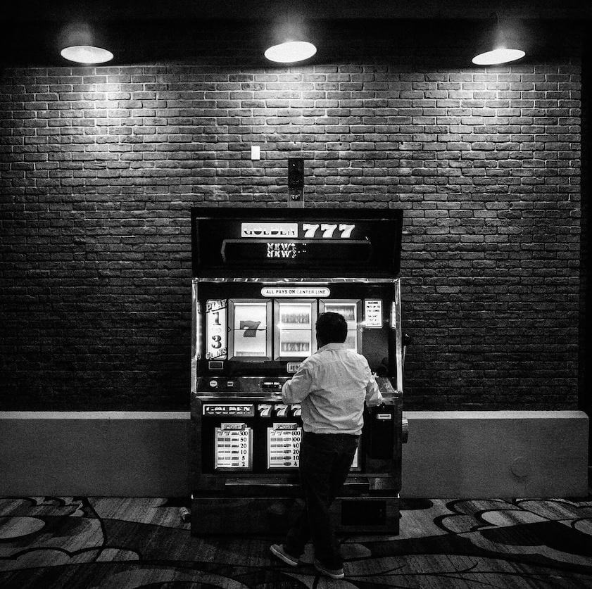
If you doubt the above statement, get this: slot machines have been around since 1895, growing in popularity in a steady pace. These days, about 80% of casino floors in the world are filled with different slot machine games; the rest is divided between the green felt tables.

According to a CBS survey, Americans now spend on slot machines more than movies, baseball and theme parks combined. And this is with only three states where gambling is legal.
The Machine Zone – Conquering Attention Retention
Slot machine game developers have mastered the art of attention retention.
In her influential book, Addiction by Design, MIT anthropologist Natasha Schüll coined the phrase slotification and explains this retention phenomenon by her Machine Zone theory. It’s just like when you’re in “the zone” only it’s the “machine zone” where there is no sense of time, money, space, or any of your basic needs.
Sounds familiar? Let’s think of the “Facebook zone” when you’re nothing but a scrolling thumb looking at pictures of your friend’s ex boyfriend’s brother’s girlfriend’s photo album of backpacking in Europe. Wait a minute, how did you get to that page? You can keep that answer to yourself.
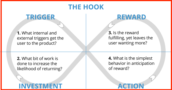
That’s right, you’re hooked to social media and that’s thanks to the four stages of forming a habit as prescribed by Nir Eyal, a tech entrepreneur that has spent his career in the gaming and advertising industries mastering these techniques of manipulating and motivating users.
- Trigger – prompts the user to take an action
- Action – leads the user to the anticipation of a reward
- Reward – reaction from other users or from the product
- Investment – the more you use the product the more valuable it becomes

source: Nir Eyal
The Flow Of Retention
Almost every digital product these days work to replicate the psychological design principles of slot machines. Why? Because they all thrive to achieve the same level of attention retention.
Schüll illustrates the flow in slot machines as follows:
- The activity must have a goal
- The rules for attaining this goal must be clear
- The activity must give feedback
- The tasks of the activity must present a challenge
Let’s think of Tinder and see if it’s a match.
- There is a goal – finding a date (or garnering some attention)
- The rules are clear – both of you need to swipe each other right
- The feedback – Match, or lack of
- The challenge – appearing attractive
It works with any other successful App or product out there. Give it a try and see for yourself.
But creating the flow is only half the work. The other half is making sure your users will come back for more and more flows.
Hook Your Users
Successful products cause their users to form a habit.
Digital product designers are after habitual use like in the slot game design. They want their products to become an inseparable part of the user’s life. If any one product achieved this it is Facebook.
Facebook is astonishingly habitual. According to recent studies, Facebook makes up 11% of all time spent online in the US. Average time on Facebook by its users: 400 minutes a month.
To understand why, let’s look at the four stages of the hook and how they contribute to form the habit of use.
We have: Trigger, Action, Reward, and Investment.
Connect Problems and Solutions
Eyal defines these four stages as the way to connect the user’s problem to the company’s solution in order to form a habit.
We can all agree Facebook realized the world’s inhabitants would actually want to connect with others and see what they’re doing 24/7.
Realizing a problem is a task of its own. So you had a problem, you successfully designed the product but now, how do you justify the frequency of using it?
Let’s break it down stage-by-stage using some of today’s popular apps: Tinder, Snapchat, and Facebook. A little bit of love, humor, and stalking for good measure.
The Trigger
There are two different types of triggers: external and internal.
External triggers a call to actions such as “click here”, “play this” etc.
Internal triggers are also call to actions but are motivated by emotions, memories, associations. Perhaps if you’re feeling bored, tired, confused, or frustrated then that’ll influence your decisions.
Tinder feeds into the triggers by feeding you with singles ready to mingle with their modern day version of the a/s/l.
Feel badly that you didn’t go out this weekend? Snapchat will feed into you being nosey and provide you with a 24 hour time limit to check out everyone’s party-hopping Saturday night at the hottest club. The 10 seconds will leave you wanting more.
And your internal triggers might make you feel antsy if you don’t check up on your Facebook newsfeed–you might miss out on who just got engaged or promoted at their job.
The Action
Why do we keep on swiping right or left on Tinder or pressing through the story of someone we hardly know on Snapchat? We do it because we’re anticipating a reward that hopefully something amusing will happen. That’s the action.
Maybe today on Facebook something extraordinary and “omg” worthy will happen. Or maybe not.
Our actions promote habitual behavior. Higher motivation and simplicity is all it takes to form that habit.
Here again Tinder is a prime example. Our motivation on Tinder is extremely high—we all want to meet quality people and have long lasting relationships (no laughing) and it is unbelievable to achieve by swiping right. Or so we’re led to believe.
The Reward
Our brain is most active in anticipation of a reward. Once we get the reward, our excitement actually subsides.
It’s always when you match with that cute person on Tinder that the reward is feeling good someone admires you but that quickly subsides with blasé feelings. You eventually start to stress about who will initiate the conversation first and if you’re missing out on someone else.
The same applies for Snapchat and Facebook. The feeling of knowing you’re “in the know” is the reward but the important thing for product designers is keeping you in a constant stage of anticipation. It’s about finding that perfect balance between anticipation and reward.
Pigeon in a Box
Once upon a time there was a behavior psychologist named B.F. Skinner who put pigeons in a box (poor fellas.)
He conditioned them so that the action of pressing a lever would reward them with food. Once they got used to it he randomized the rewards. Some actions had food, some had zilch.
So what happened? The pigeons anticipated the reward.
Action vs. Reward Balance
When actioned were rewarded too often, the pigeons could care less and decreased the number of actions.
When the actions were rarely rewarded, the pigeons decreased the number of actions because they lost all hope.
As a product designer you want to find the right balance of action vs. reward. If a slot player never gets a big win on a game chances are he’ll find another game. If you never find a date on Tinder you’ll probably go and join OkCupid.
Feed Me, Feed
The Facebook feed.
It’s the quintessential modern day town square filled with gossiping plebeians.
The feed’s purpose is to keep you wanting more and stay up to date with everyone’s business.
Facebook, Twitter, Instagram, Linkedin—they are all built around feed algorithms.
Facebook wins when you give into the feed by posting happy birthday to that guy you sat next to on an airplane and never spoke or saw again.
Find the Right Balance and You’ll Crack Retention
Slot machine designers have spent years zeroing on the exact rate of return that keeps players satisfied, but not too comfortable. If it’s too easy, players lose interest. If it’s too difficult, they’ll go find something better. You can check out our Fruity Friends slot review to see what we’re talking about in terms of this balance.
So don’t get angry when Grandma sends you Candy Crush life requests through Facebook, blame the designers for finding the right balance!
The Investment
The final stage is Investment. You’ll need to figure out a way to make translate the investment of time and actions in the product to value.
Unlike physical products that depreciate in value after wear-and-tear, digital products become more valuable the more they’re used.Google Drive is one important asset where you’ve uploaded hundreds of files. It becomes a treasure and all hell will break loose if your family photos get deleted. It’s an investment that becomes tangible.
Completing the Circle: Gamification To Slotification
Back in 2009, Foursquare was one of the first to introduce the idea of gamification to a non-gaming product with the introduction of the Badges. In those days, you really wanted to be the Mayor of your local bar so you would compete with everyone on Foursquare for the title.
That gamification fad has evolved into slotification. The added value of slotification is eminent as new stunning graphics are introduced such as the ones in Light slots.
Now it’s all about time spent on product, slotification. Incorporating the principles of slot game design, the flow of retention, and the four stages of forming a habit into product design can help you create more successful products.
Today, it’s about products that not only swallow you in for long stretches of time but ones that create value for the users in return of their investment of time and effort.


